
Athena (2022)
Athena
Task Management System Redesign
Real Project/ Reality Work
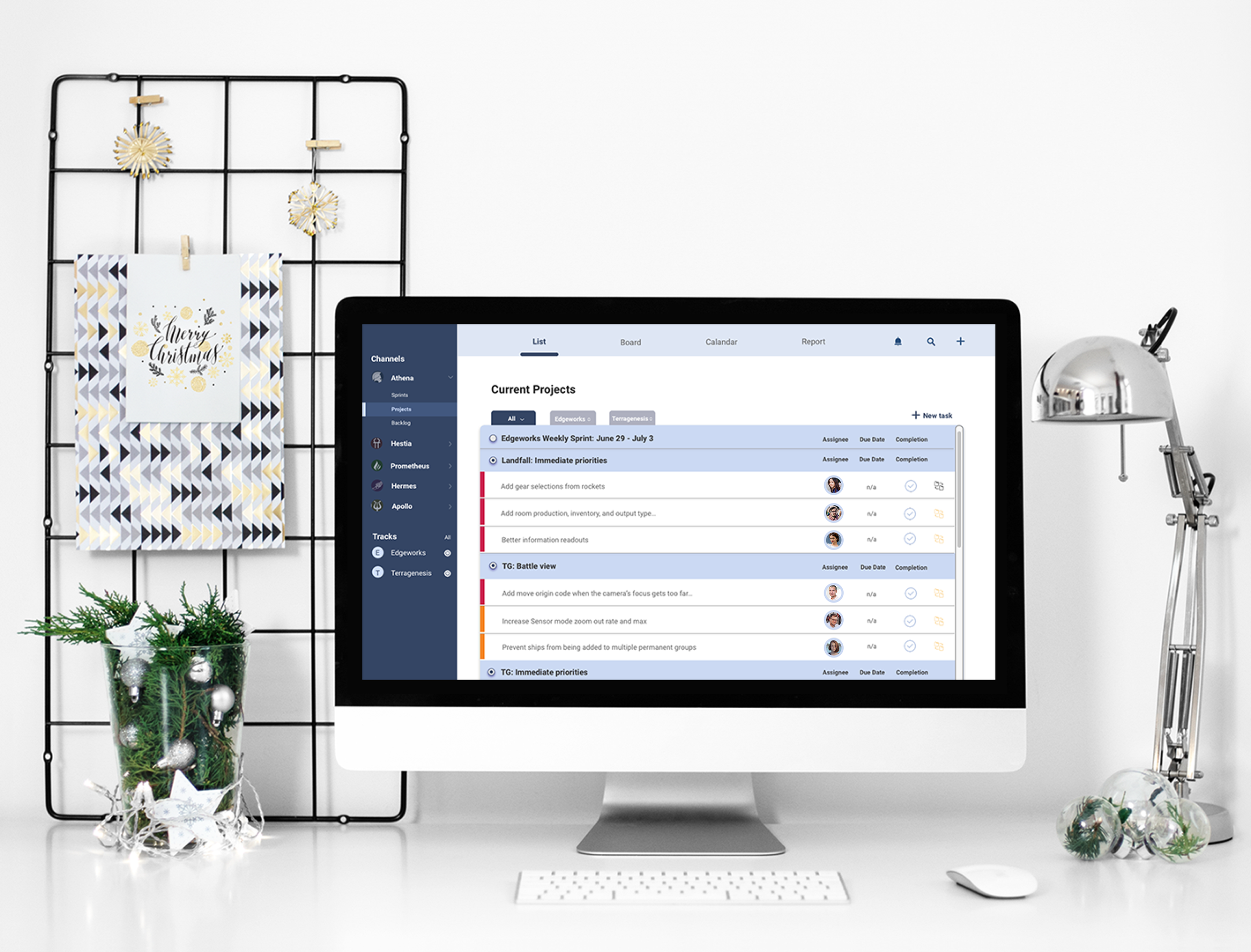
Athena is an internal productivity and task management suite for Edgeworks Entertainment. The in-house team uses it to increase team communication, and raise their productivity level in one place. Fear not — this idea of redesign a task manager desktop app can help you avoid drowning in a sea of tasks. The app to help you get on top of your to-do lists or managing all your tasks which are important for you.
Problem
Everyday our co-workers use Athena as a daily task management tool. But it takes longer time for them to create task and find their task they just created due to the unclear navigation.

Lacking visual hierarchy
Our previous version of Athena looks outdated. The listing page has large volume of information with limited white space. The navigation is not clear enough, and there are a lot of overlapped content.
Design Objective
Provide a clear and easy navigation when adding and editing task.
Improve the dashboard’s visual hierarchy.
Sort out the categories of the tasks. ( All tasks, My tasks, Completed tasks etc)
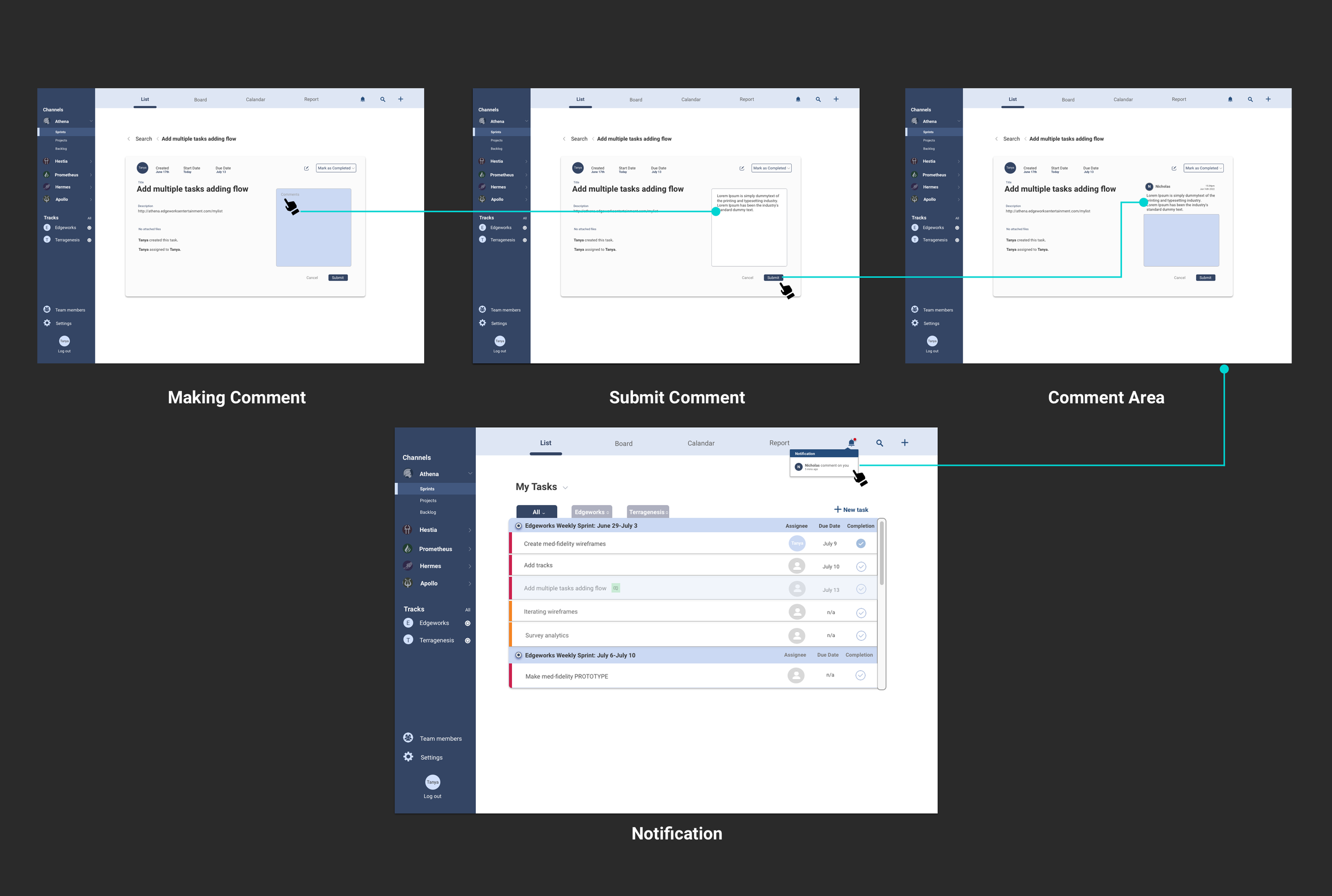
Make recurring tasks easy to use.
What I do from end to end:
1. Research-survey.
2. User scenarios.
3. Quick sketch.
4. Wireframes.
5. Mockups.
6. Prototypes.
7. User testing.
Research Insights
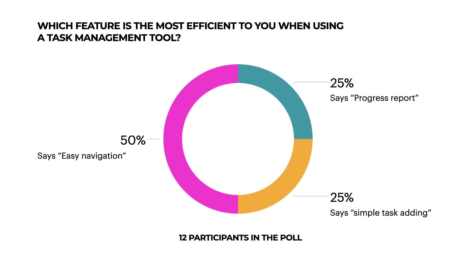
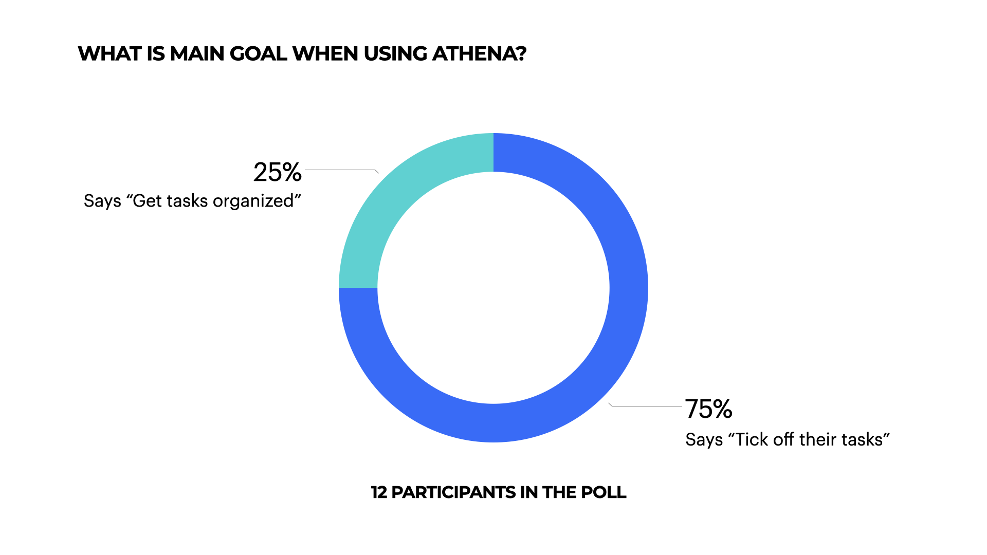
I conduct a user survey as a starting point of this project. The user survey turned out very straight forward. More than half of participants expect Athena has an easier navigation, simple task adding and searching, and more organized dashboard. The users also hope to have a short-cut to solve their needs of adding repeated tasks.

Site Map

Initial Sketches

Medium fidelity wireframes: https://invis.io/EAY4UQ492M7#/425783042_Projects_All_Expand_Edgeworks
Exploration

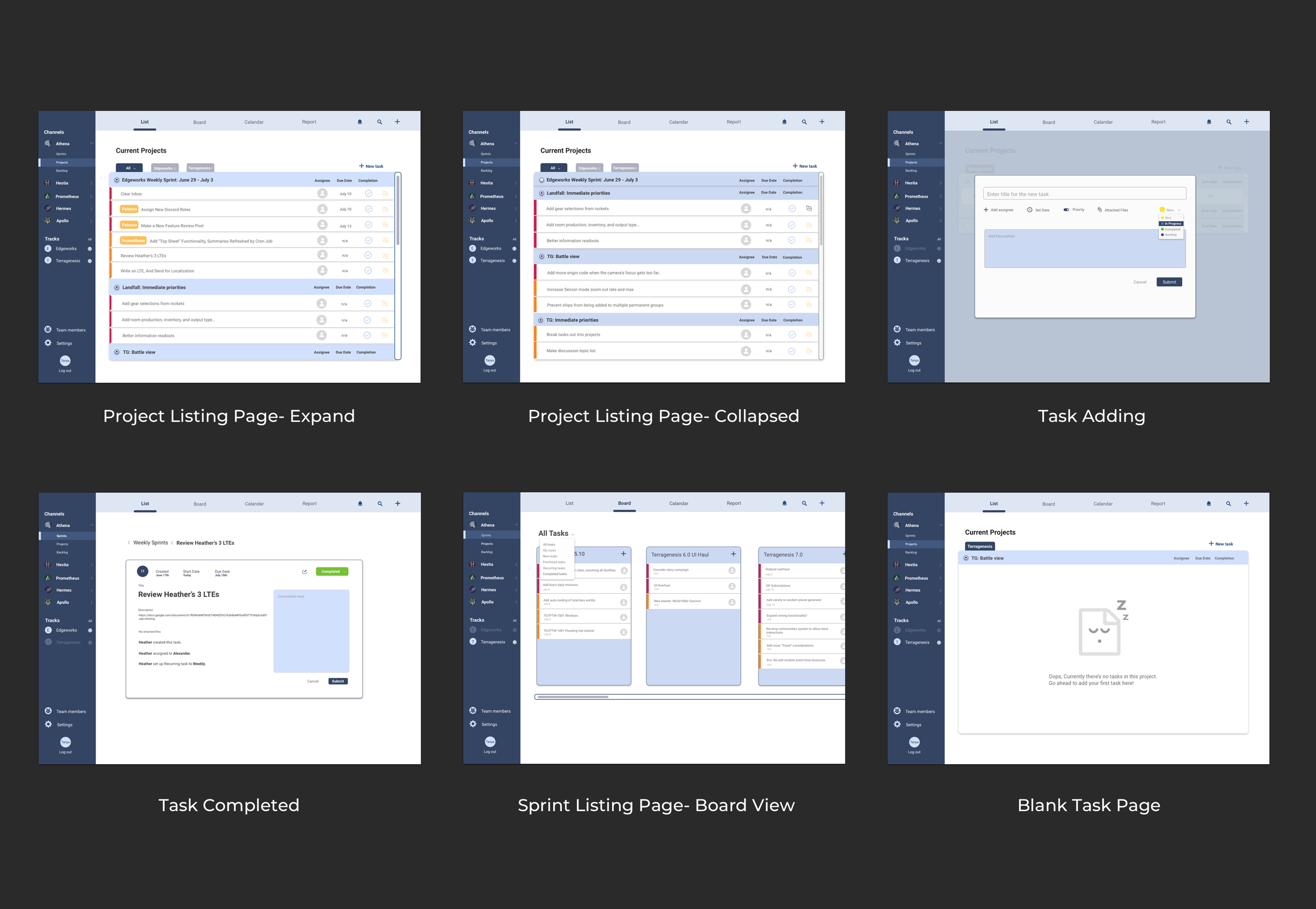
The Design - Main Pages
The Challenge
Before devs moved forward to the implementation, a question came to us. As you all know, we use users insights to inform the design decision. Our solution for “How to organizing large volume of tasks under each project or each sprint in a clean way” is to adding UI accordion on the task list page to giving users an option for reduce the scrolling area.
But does the accordion feature really reduce scrolls? What is the accordion looks like when users interactive with it? the Auto-collapse view or the Multi-expand view?

Testing
After the modest research about plenty of design systems and component libraries, meetings with Engineers and PM, and my own experience designing them, we decided to use multi-expand accordion to give users always full control, and giving them contextual sections when they need to look at the tasks back and forth. We observed our users which is our co-workers to interactive with the prototype(accordion feature). They all successfully went though, and satisfied with the result that they can control their tasks list by collapsing each section individually.
Multi-expand behavior
Gives the user the capability of having multiple sections open at a time.
Buttons for expansion/collapse all can be used.
Increases the scrolling area.
Auto-collapse behavior
More of use in side menu or hamburger menu.
Doesn’t work well when there are a lot of content.
Increases the cognitive load.
Reduces the scrolling area.
Usability Report

Improvement
Before:(Original Look)

After:(the redesign)

We Initiated and executed a comprehensive user research initiative that identified key pain points in the existing product. Implemented strategic changes based on this research, resulting in a 18% increase in user satisfaction scores within 3 months. Championed accessibility improvements, ensuring that our internal tool met and exceeded industry standards. We’ve lowered error rates indicate a more user-friendly interface.