Expedia Experience redesign
Group Project
Personal Case Study
Expedia is a commercial website that claims to help users obtain discount rates for travel-related purchases such as airline tickets and hotel stays. It became known for its various deals for travel stays.
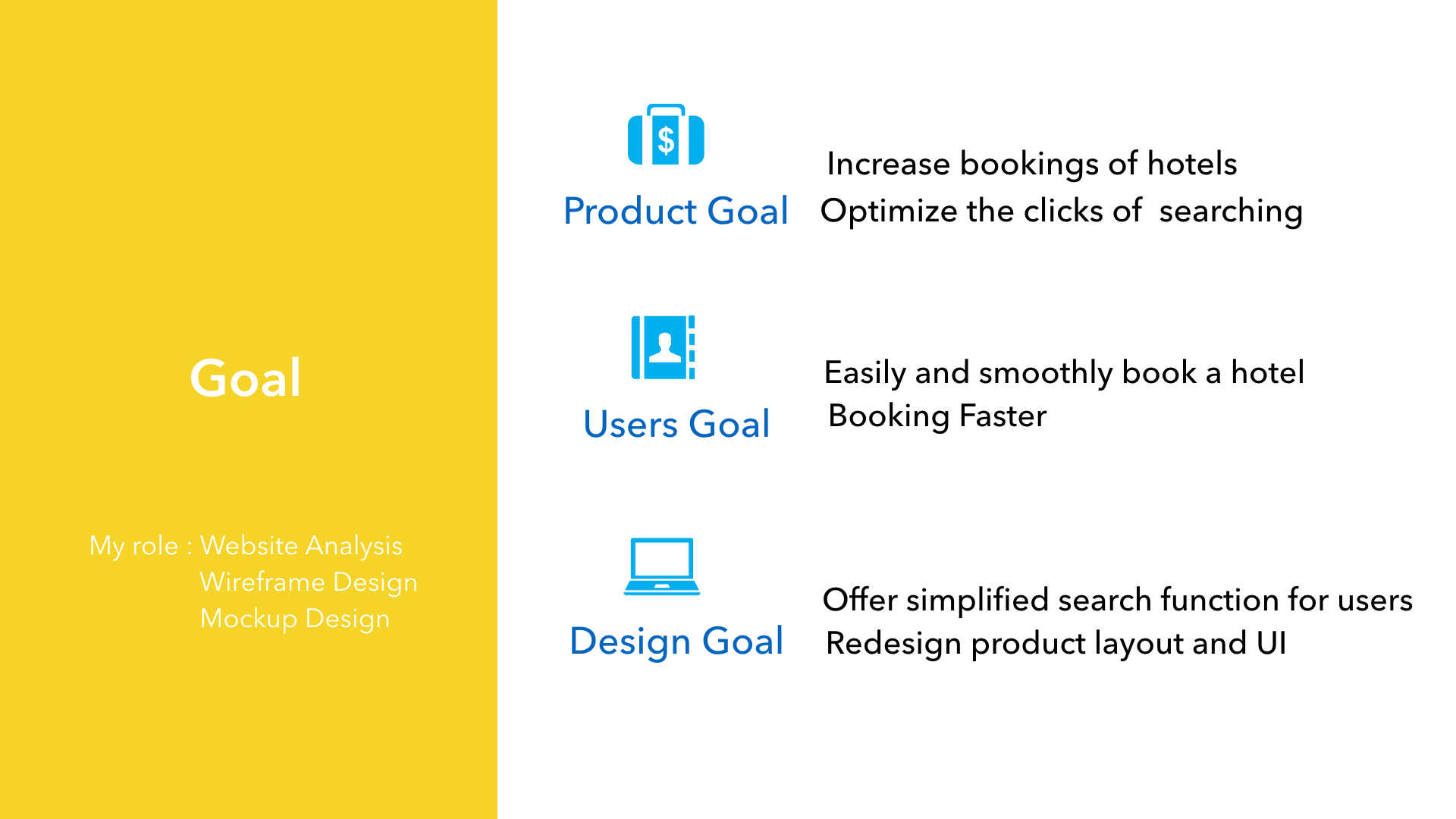
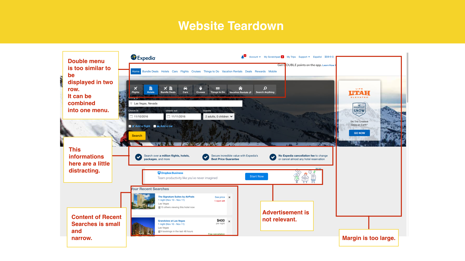
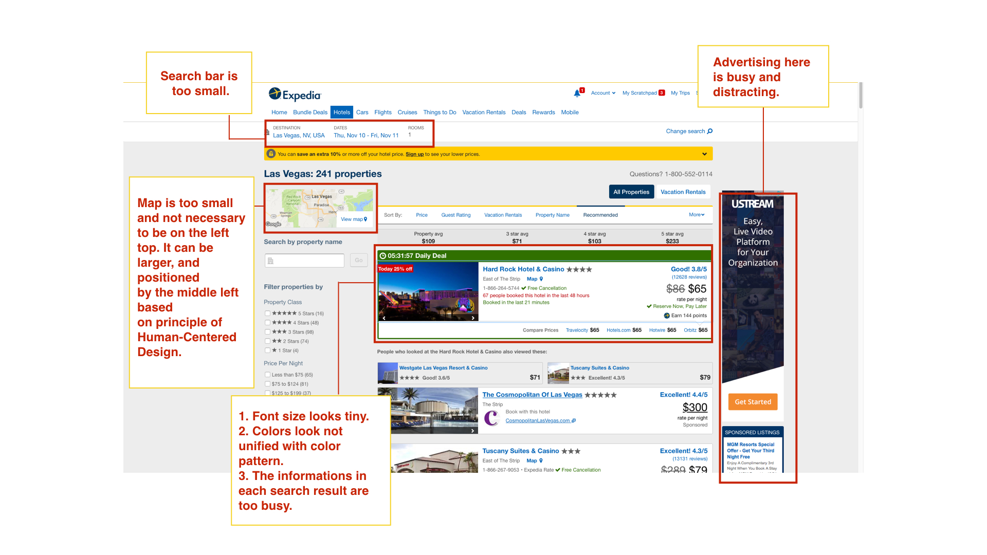
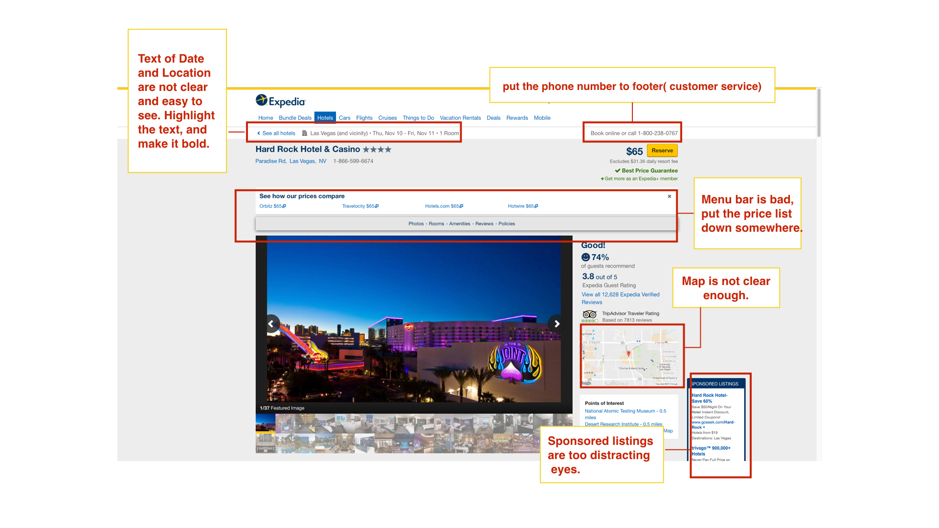
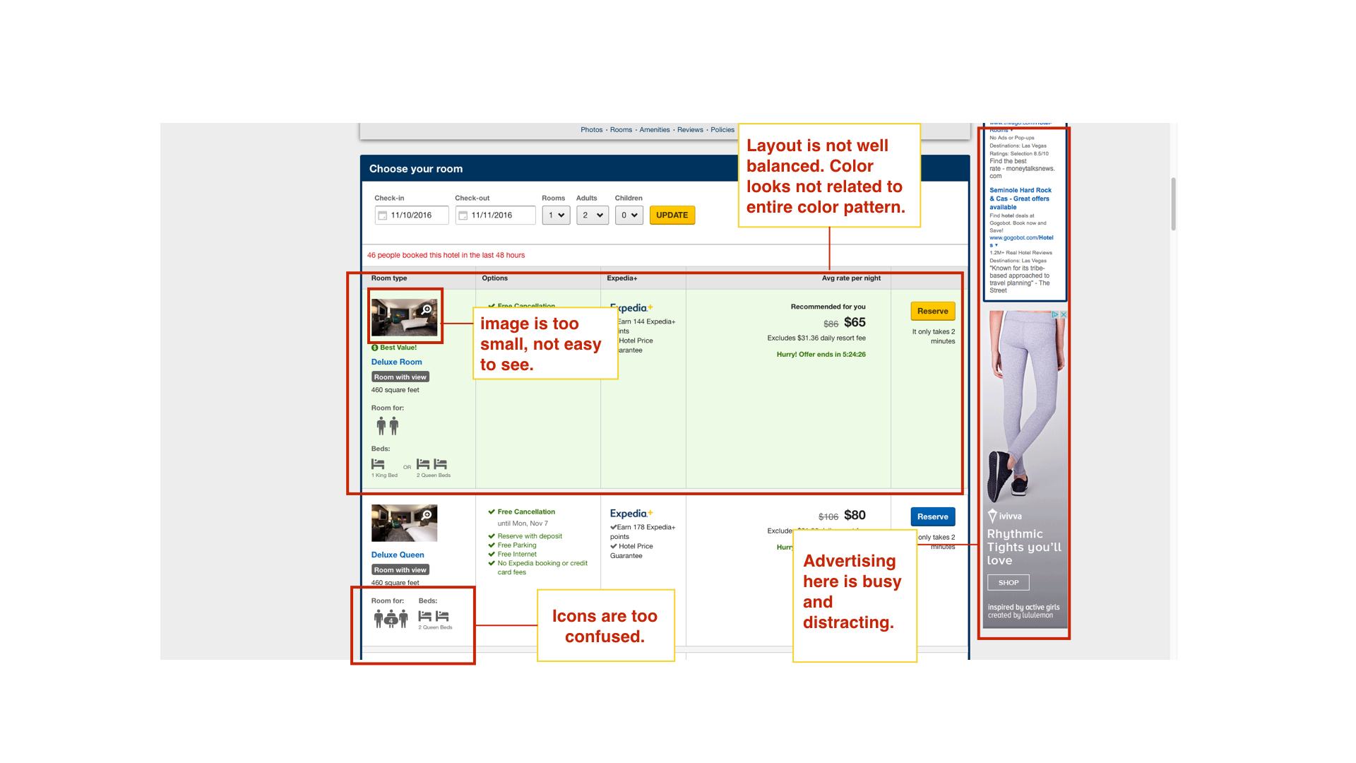
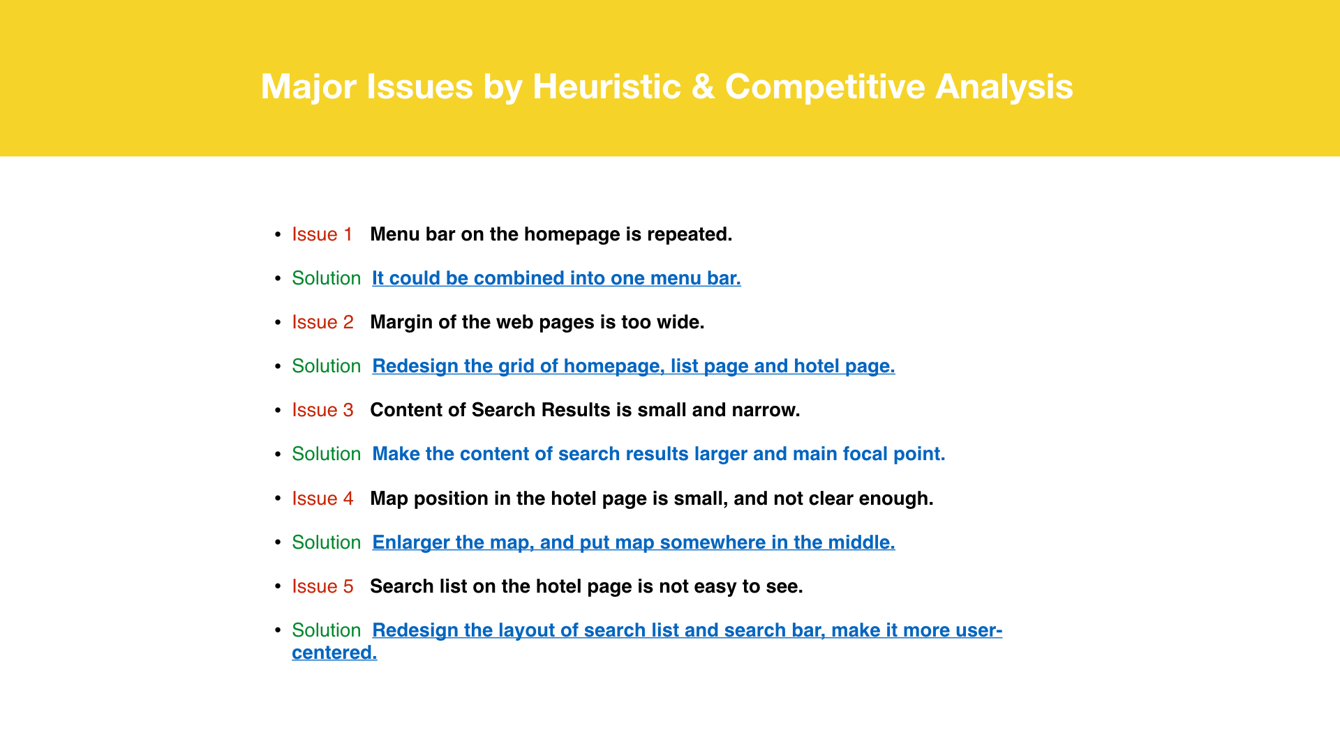
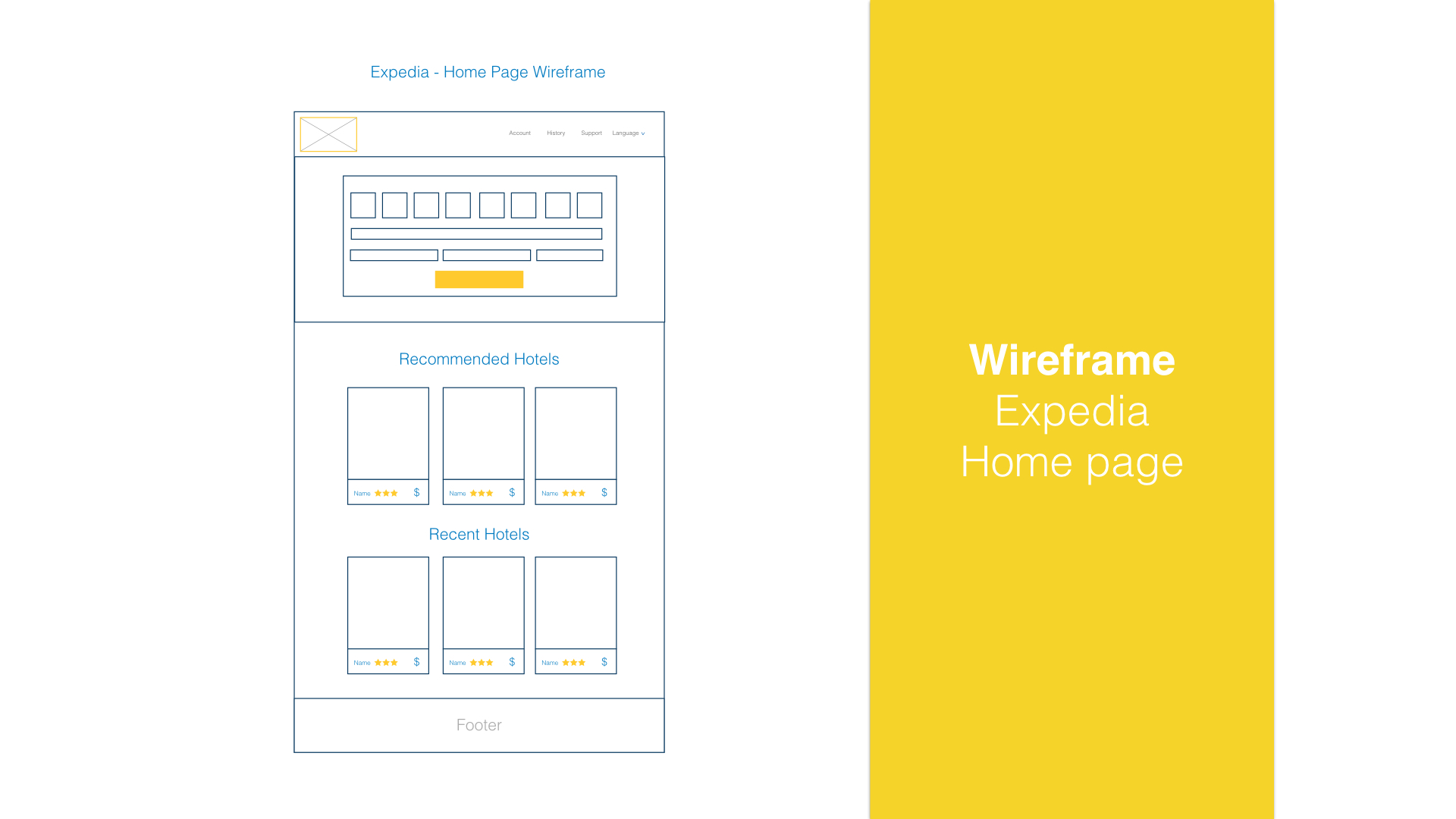
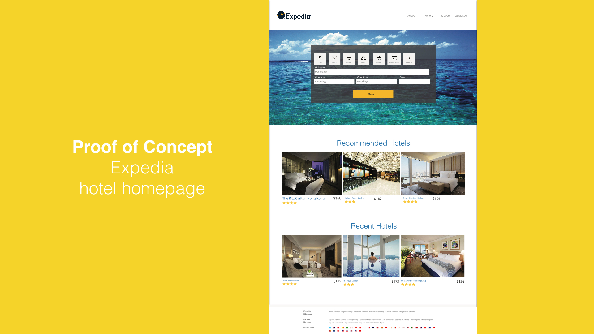
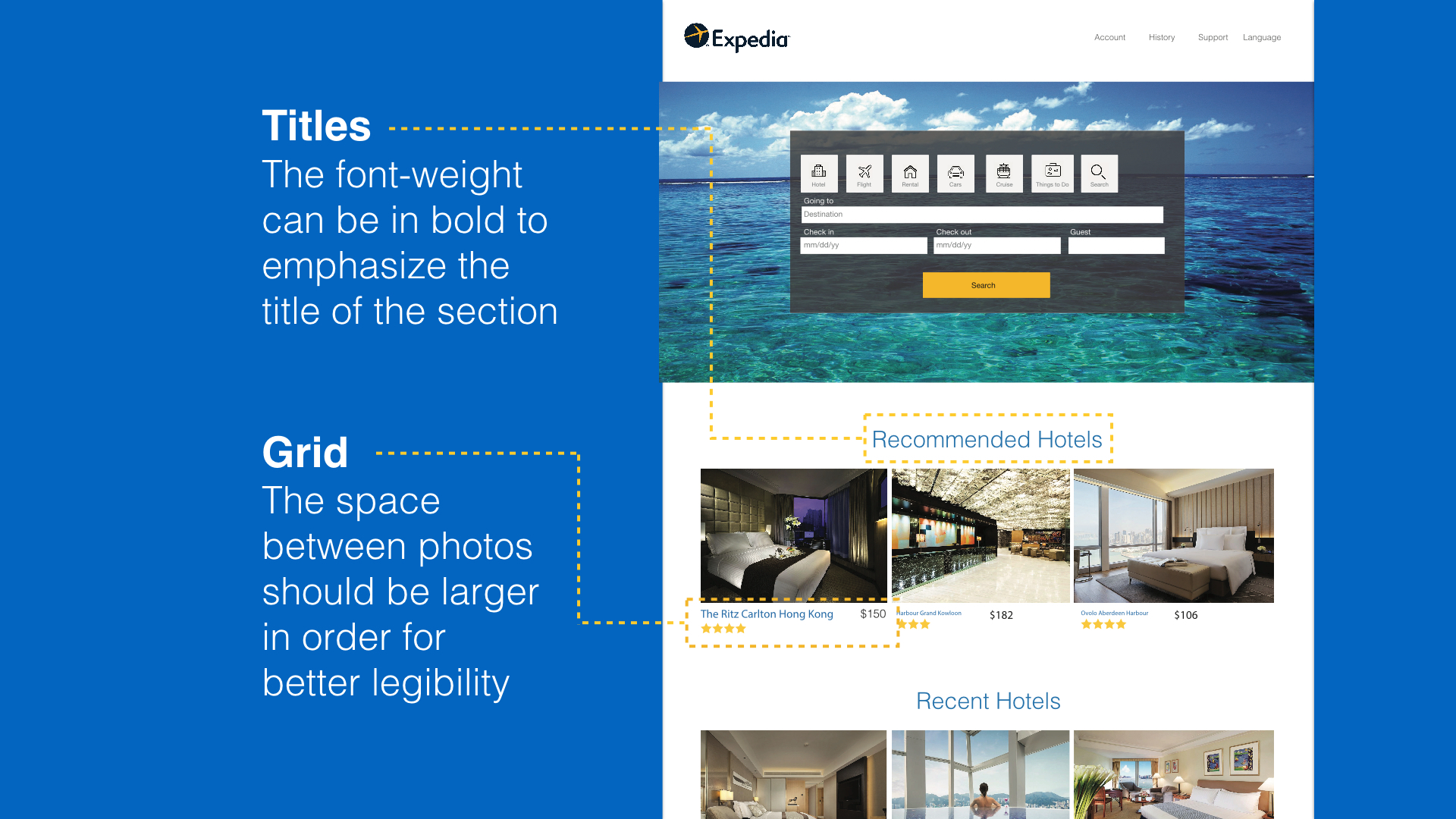
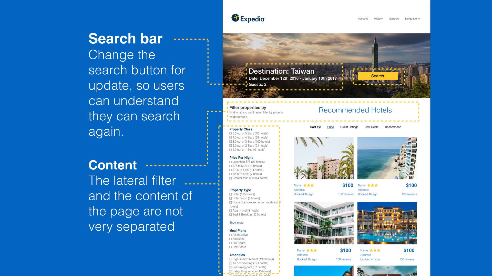
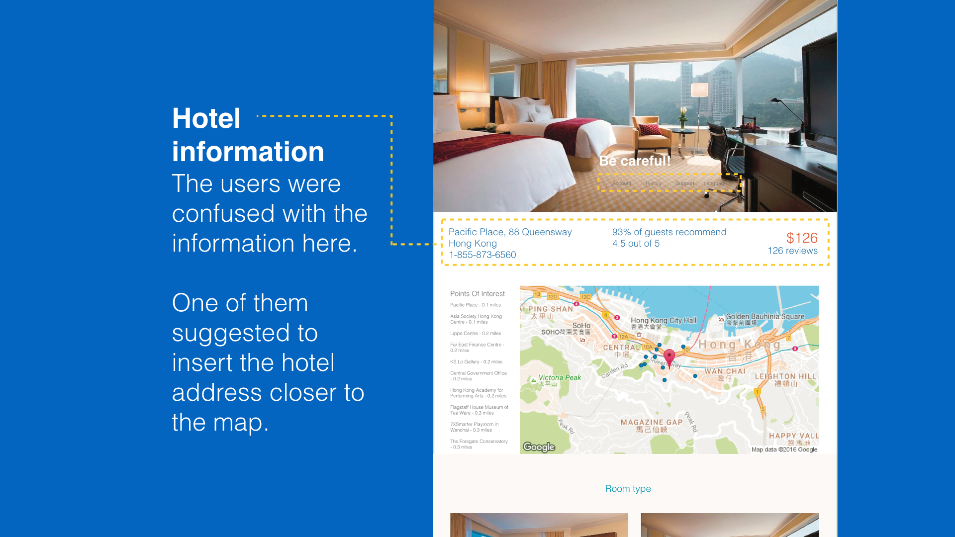
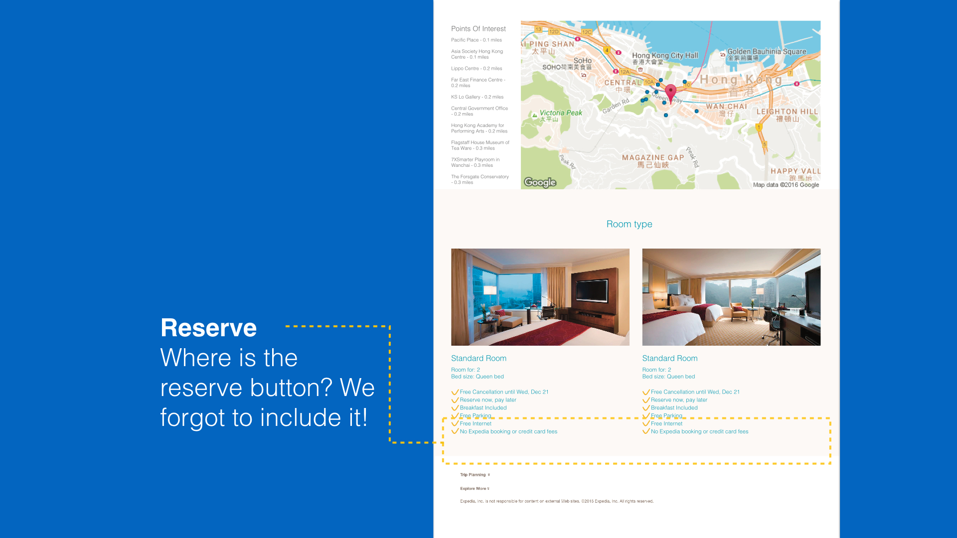
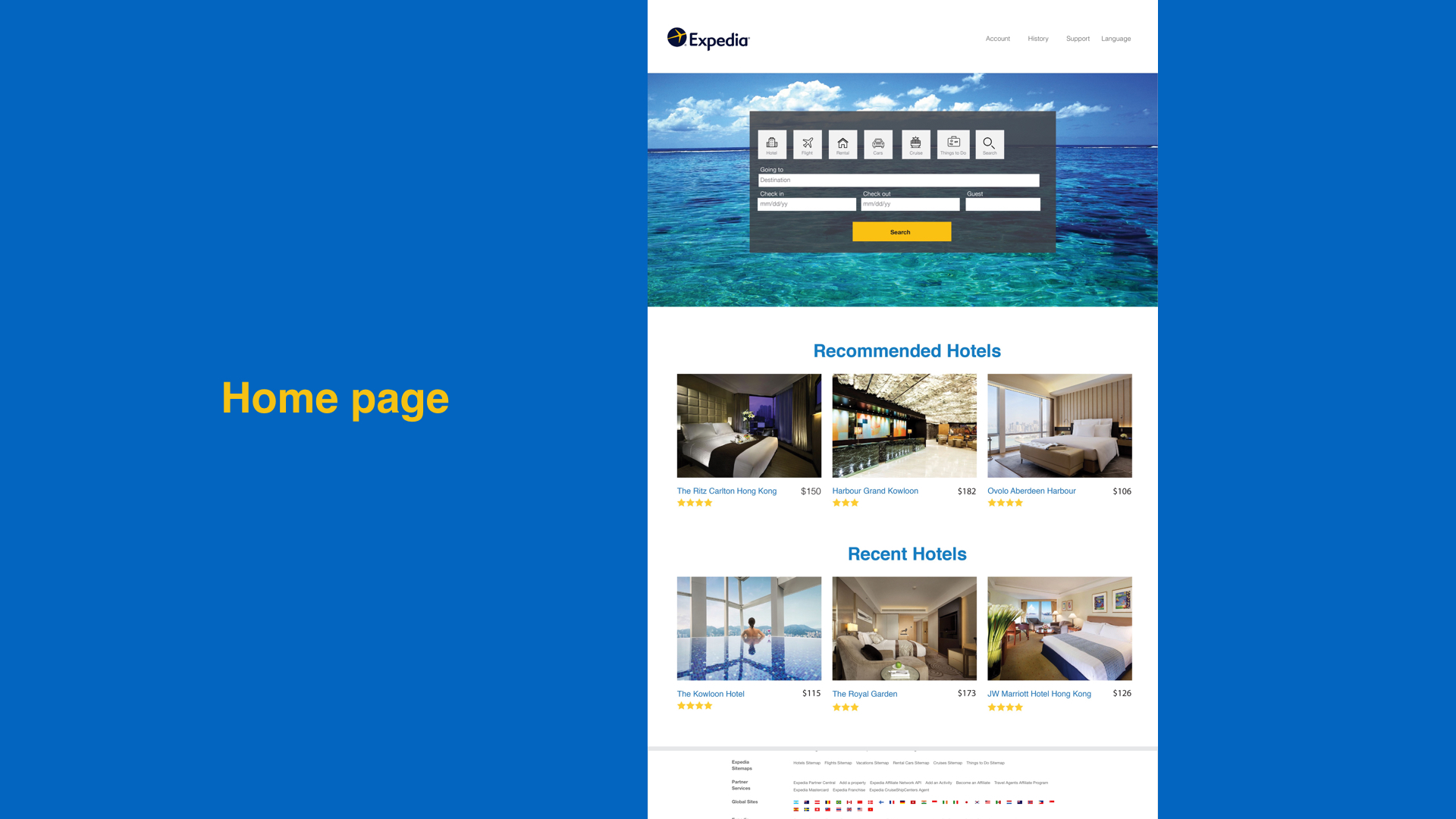
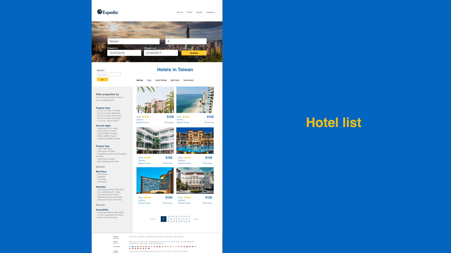
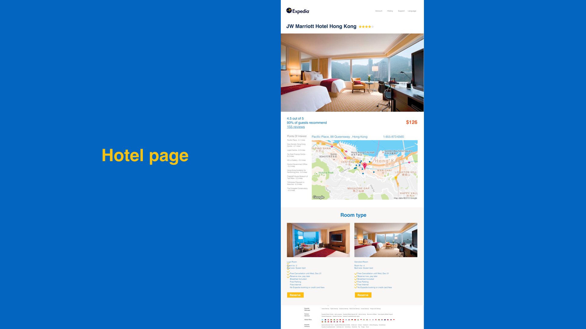
I like this product personally because it’s easy to use in web, and covers everything I need to book during a trip. However, the website is not that user-friendly as their mobile version. According to my research, I found that most hotel search on Expedia are very useful, but not efficient enough for fast booking. Besides, compared to some other competitors, the UI design looks not attractive. I think a redesign might help.
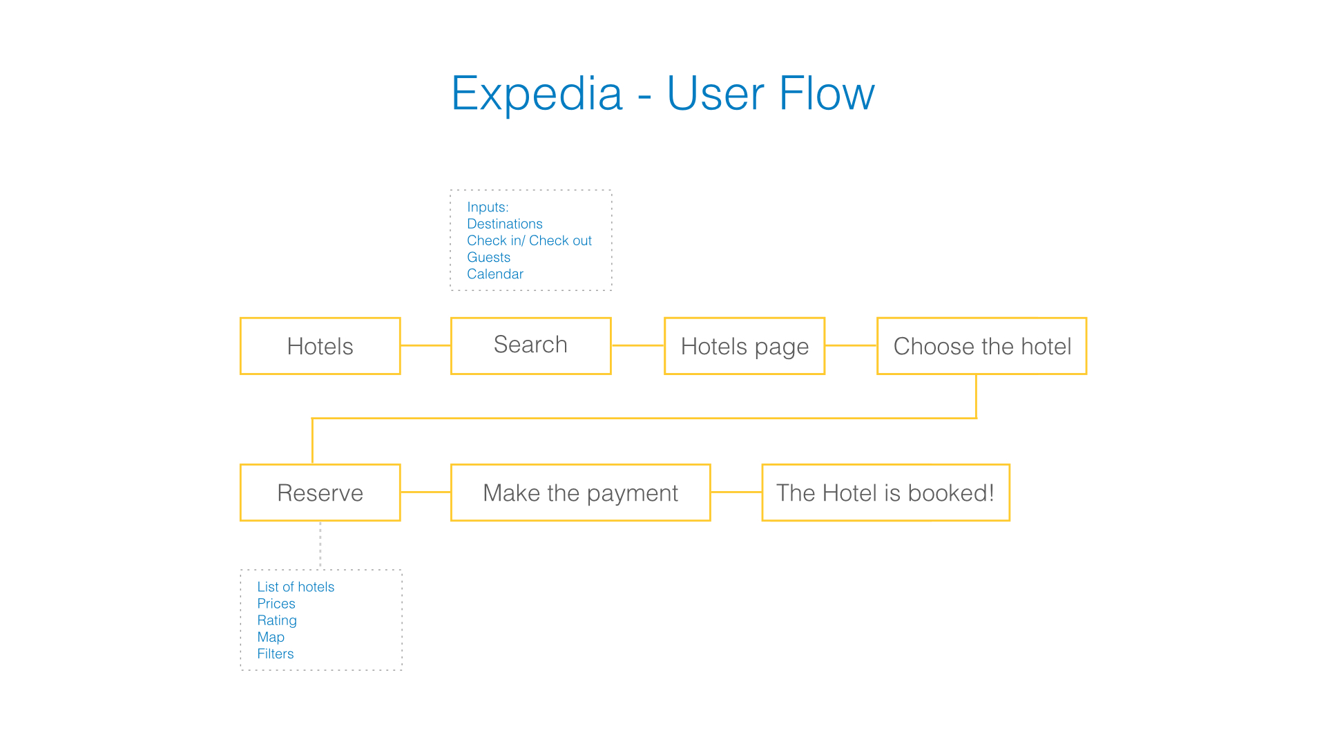
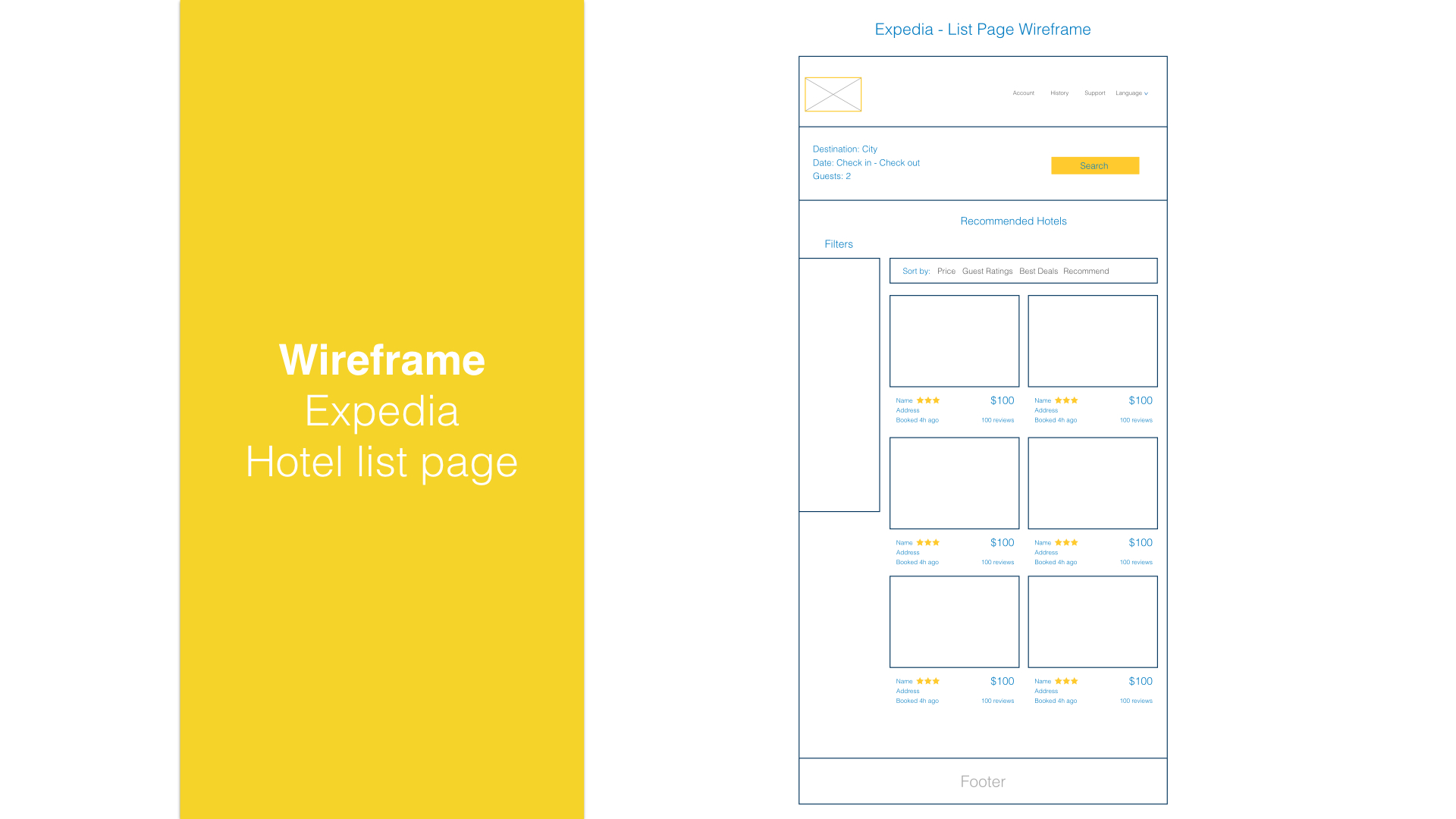
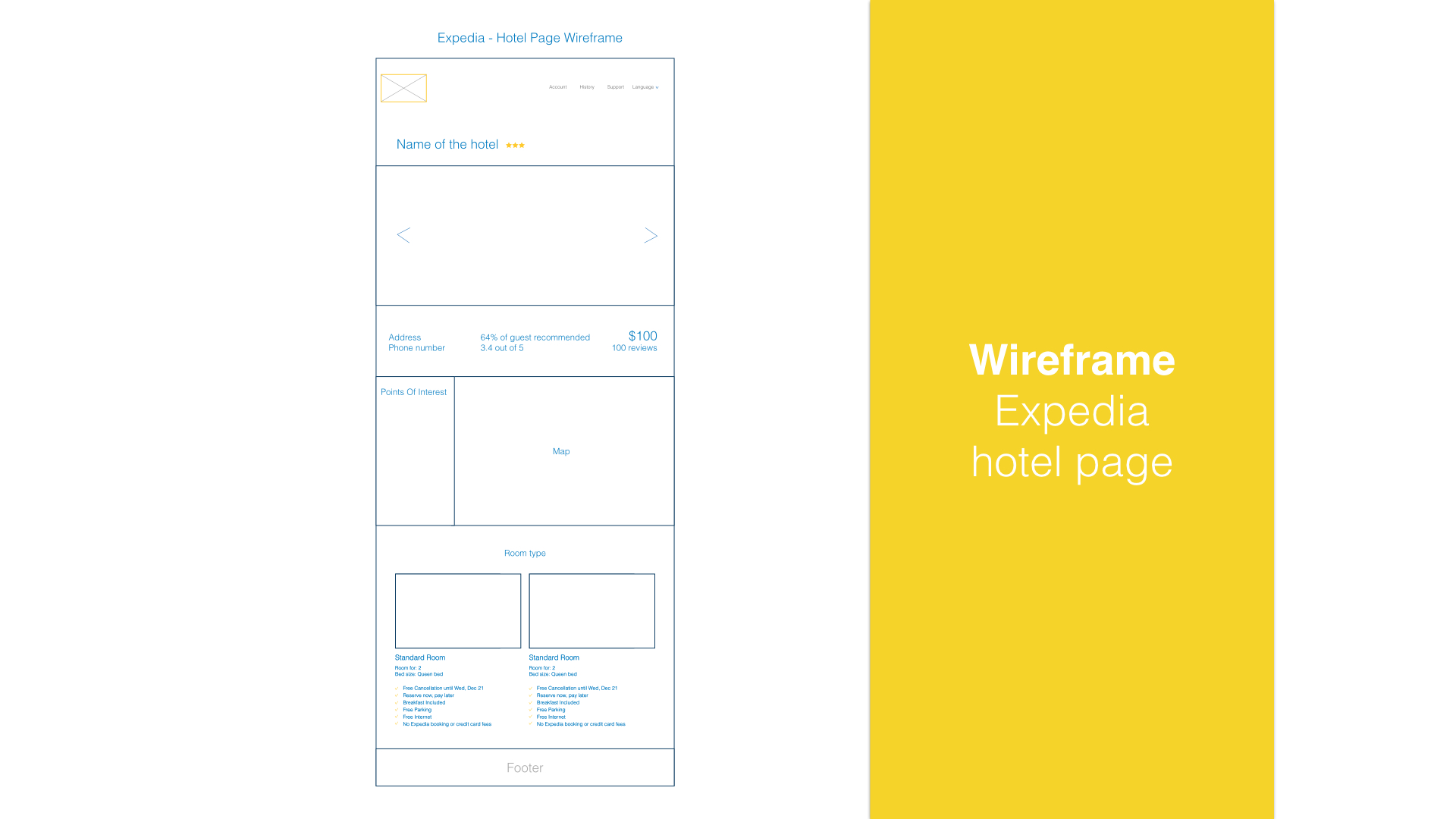
Considering the complexity of the business lines of this product, I finally picked the hotel search as my redesign target because it’s the most common one people used on Website.

